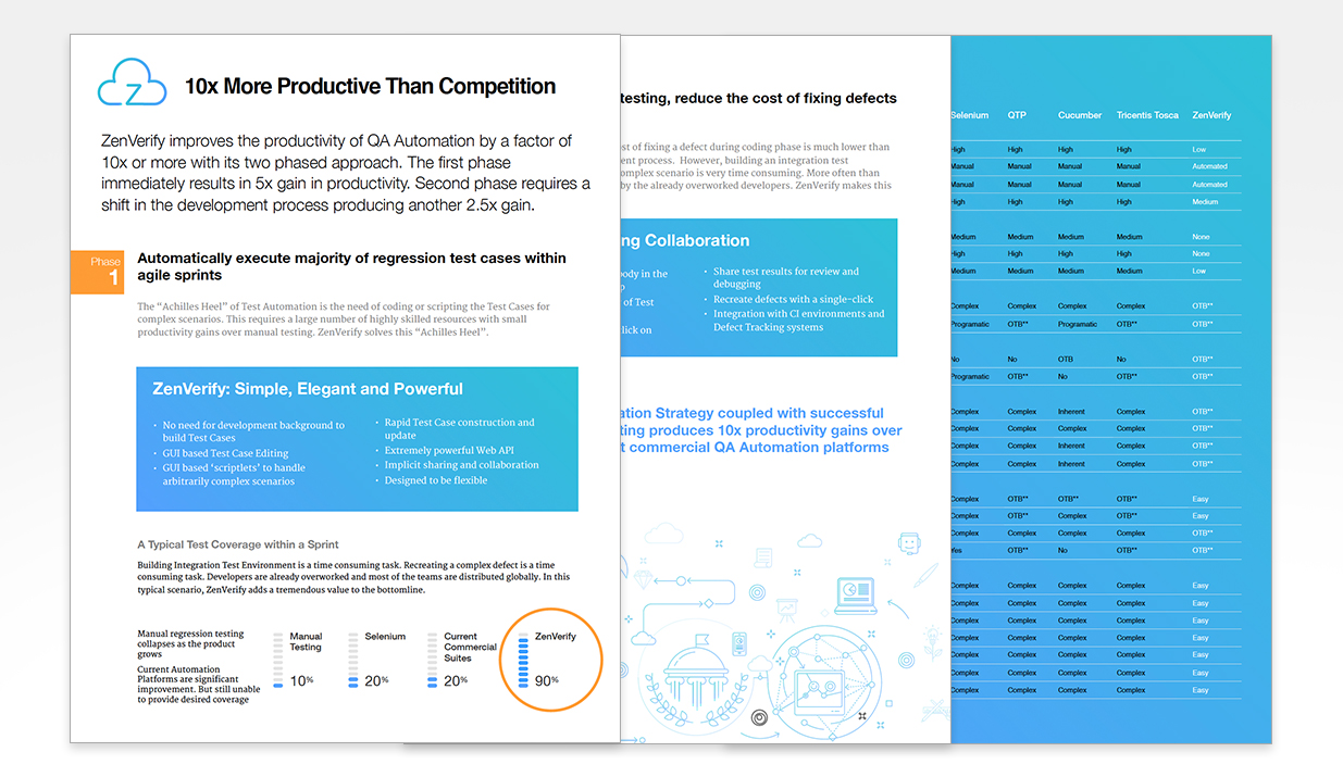
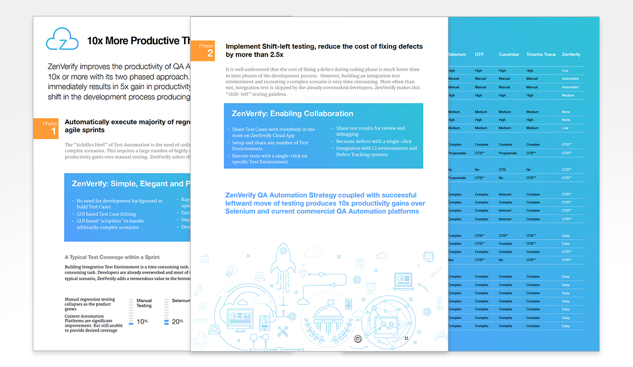
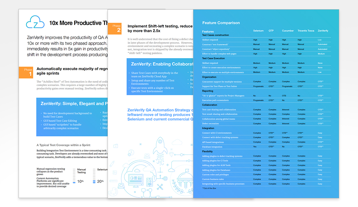
We often call ourself “problem solvers”, so this case is slightly outside those bounds. Most of the time when we are solving problems, developing something unique as an identity of the product is not the goal, but we make sure the end results are appealing, charming and has a unique identity or else the solution is incomplete.
This problem is different, because ZenVerify has a very compelling product and works optimally from design perspective. But where is lacks the mojo is to communicate to new prospects what it does, and to stand a chance among competitors. Our job was to provide voice and tone to the product to help communicate it. Our objective was to help ZenVerify craft a vision that is tasteful, minimalist and visually appealing. Everything from content, website to logo was up for grab.
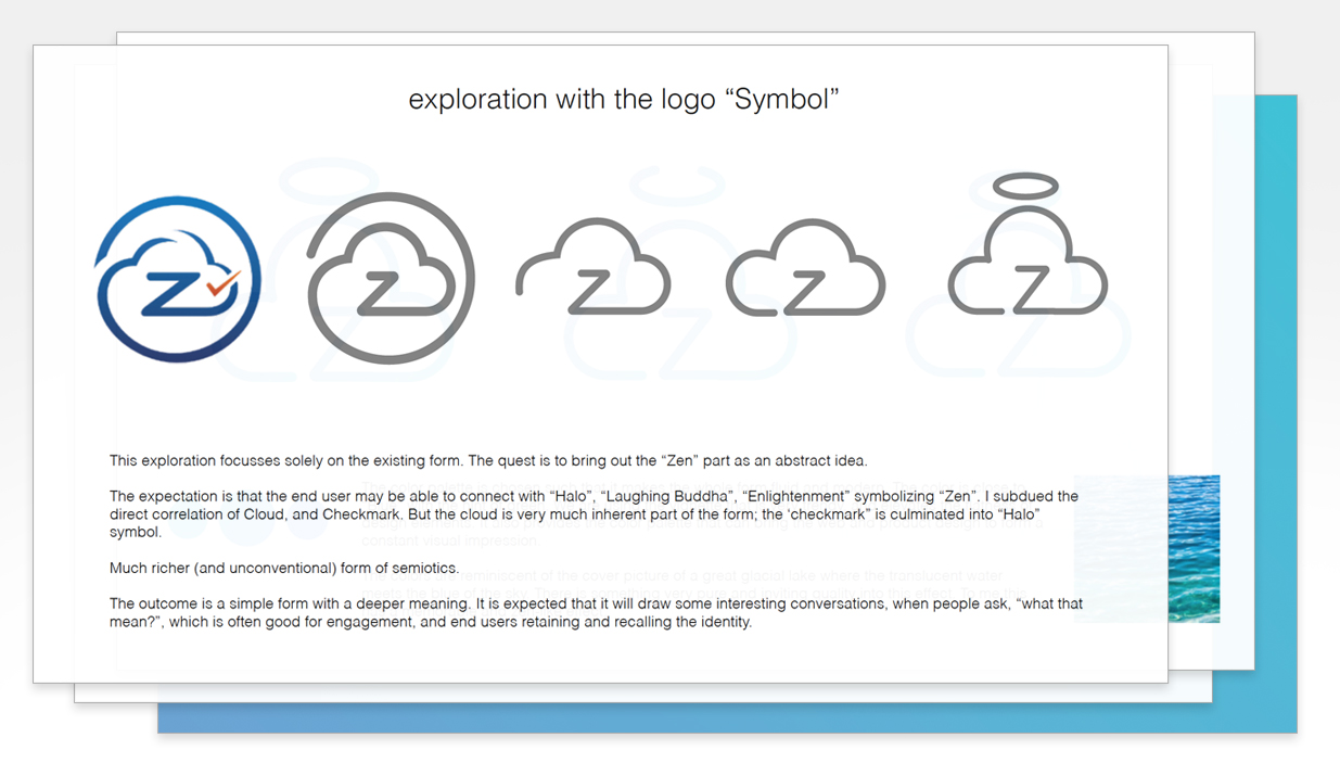
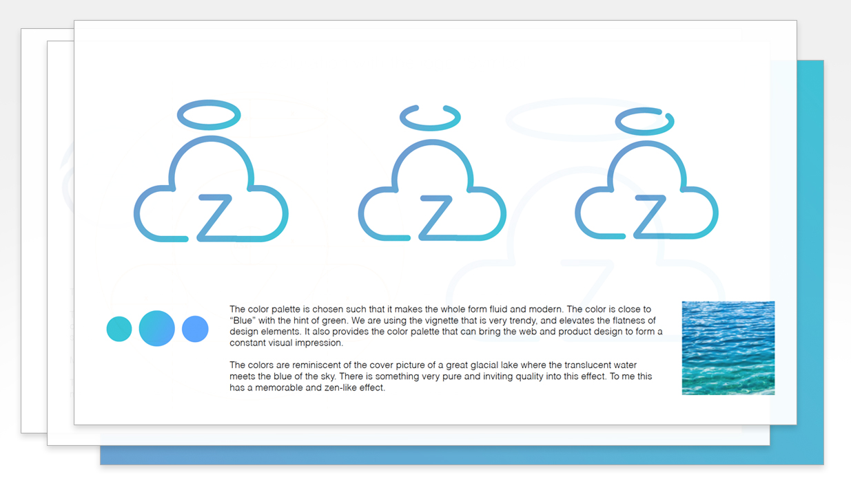
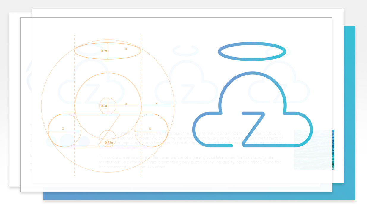
The new logo is presented below. It shows the evolution and design exploration

